
Covers matter. Sometimes it so happens that an absolutely gorgeous cover is redesigned to target a different audience. Sometimes they’re just bad. But sometimes, someone decides to redesign a cover which turns out to be absolutely perfect. As it’s Sci-Fi Month, I’m focusing on sci-fi cover redesigns that should exist on this planet in print. Till that happens, I’ll just gaze at these:
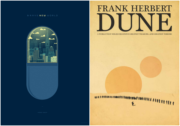
Brave New World by Aldous Huxley – This actually exists! In the form of a poster, that is. I really like the minimalistic elements of the cover. Kevin Tong designed the poster book cover and this is what he said about it:
“Books and reading have been the primary sculptor of my ideas, the ideas in this series are no exception. The book, despite being fictional, solidified within me the need to be independent and to formulate my own ideas. I think it is extremely appropriate because the city inside the capsule contains elements of London, as the story of “Brave New World” takes place in London.”
Dune by Frank Herbert – Designed by Paul J. Murray, this is probably the only cover for Dune that’d make me want to read it because it speaks to me.
“This was originally intended to be an alternative poster design for the film adaptation but it wasn’t really working as a poster for the film, so I decided to change it a little and work it up into a cover design for the original novel by Frank Herbert.”
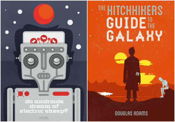
“The All Day Everyday Project was something like my graphic design diary. Everyday I took 60 minutes to design whatever I wanted to. When you work for an agency or clients, you’re often not allowed to make things look exactly like you want it – which is sometimes frustrating, but that’s the way it goes. So to keep stuff in balance, I decided to start this project.”
The Hitchhiker’s Guide to the Galaxy by Douglas Adams – I must admit, I really don’t like any of the covers for this book which is why Wayne Dorrington’s redesign awed me. It speaks to me. In the words of Dorrington himself:
“In the scene shown, Arthur is experiencing his first realisation that he is travelling the universe, as he watches the sun set on Magrathea with Marvin. He is explaining to Marvin how awe inspiring it is, and Marvin replies that its rubbish. Marvin’s job in the books is very much reminding us that the universe in Adams world is fraught with errors and breakdowns, no matter how hip and froody it appears.
In the distance we can see the Heart of Gold, the spaceship stolen by Zaphod Beeblebrox that carried the heroes to Magrathea. Tucked in Arthur’s pocket (or bag, its not clarified which) we see his copy of The Guide, lent to him by Ford Prefect.”
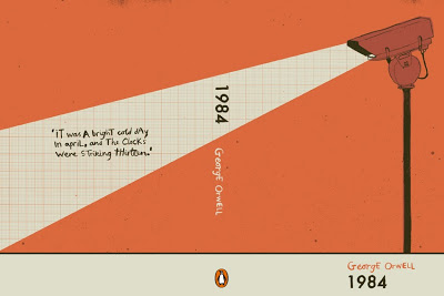

“Fahrenheit 451 is a novel about a dystopian future where books are outlawed and firemen burn any house that contains them. The story is about suppressing ideas, and about how television destroys interest in reading literature.
I wanted to spread the book-burning message to the book itself. The book’s spine is screen-printed with a matchbook striking paper surface, so the book itself can be burned.”
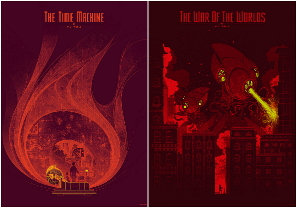
“To satisfy my book lust, I proudly present these posters for The Time Machine, by H.G. Wells. Wells has always been important to me, since he pretty much invented science fiction, which is my favorite genre by far.”
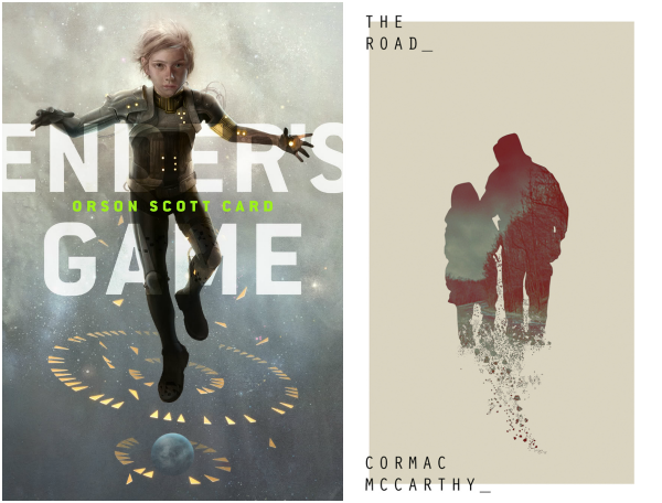
Ender’s Game by Orson Scott Card – Sam Weber designed this official ebook cover for Ender’s Game and I think it should be made into a print cover as well. I’d tell you why I like this so much but the words of the editor, Beth Meacham, describes it perfectly:
“I loved seeing Ender large with an entire planet underfoot—whether it’s Earth or the alien planet, the fate of both worlds depend on this small boy. The weightlessness, of course, refers to the Battle School exercises so memorable in the book. The flat-color triangles, representing the holographic game pieces, set against the realistic rendering of Ender and the planet, enhance the lie of the game.”
The Road by Cormac McCarthy – A contemporary reader wouldn’t pick up The Road to read unless the cover is designed by Ian Westwater. I love minimalistic everything so this cover really caught my attention.
“For this brief I was tasked with creating a set of illustrative book covers for a series of Cormac McCarthy novels. The idea was to attract a new audience to the very traditional novels through the use of a more contemporary design.”
P.S. An io9 article by Charlie Jane Anders featured this blogpost (!).
I like your sci-fi twist to the topic this week!
TTT
Sandy @ Somewhere Only We Know
I love the simple cover of brave new world.. I NEED a poster of that! and wow, I love the animation cover of Ender's Game!
– Juhina @ Maji Bookshelf
Ohhhh my goodness. Sana these are so lovely! Thank you thank you for putting this post together and sharing it. I absolutely adore (even fan-made) cover redesigns because when they're done right they're way better than the original! And I love the retro-futuristic minimalist look so many of them have.
I remember seeing that Brave New World redesign when I started reading the book earlier this year! I was curious if there was much fan art out there (there isn't) so I could get some ideas for a project.
All of these are so lovely, for so many reasons. <3
As for your question, it's so hard to pick a favorite! I think maybe Dune just because I love that it's monochromatic and still manages to capture perfectly that spacey and almost desolate feel of Arrakis. And yes I DO wish I were a cover art designer! That's actually what I went back to school for – designing the inside and the outside of books. ^_^
I love these cover redesigns, especially the Fahrenheit 451 one. It's super nifty how it's a strike on the spine of the cover and how the 1 is a matchstick. While I haven't seen the original covers for Brave New World nor Dune, I love how the cover designs you picked are minimalistic and clean.
These are some FANTASTIC cover redesigns! I found the Fahrenheit 451 redesigned cover online at some point and just loved it!
I love the Fahrenheit 451 cover. The 1984 one comes a close second.
Oh my gosh I love ALL of these! I saw the Ender's Game one the other day when I was looking for covers, and I genuinely thought that it was a real one and wished that I had that edition.
A little bit in love with the War of the Worlds one, I would love a framed version of it <3
These are all lovely, but the redesign for Fahrenheit 451 especially spoke to me. I had seen it before on somebody else's TTT list but it never occurred to me that the spine was striking paper. That is absolutely genius and wonderful and I can't believe this hasn't been commissioned yet!
I think my favorite redesign is Brave new world 😀
These are so freakishly awesome! I already saw Fahrenheit 451 before and it's so so cool!
Great list.
Love the new design!
I love LOVE LOVE these covers!!! All of them. I have yet to read most of these books, but the ones I did read (Do Androids Dream of Electric Sheep?, 1984 and Fahrenheit 451) were wonderful. True classics of the genre.
Excellent new covers. More explanatory than the original covers. Well done!